It’s finally here: record-level data showing vaccine timing and death date. There is no confusion any longer: the vaccines are unsafe and have killed, on average, around 1 person per 1,000 doses.
STEVE KIRSCH, NOV 30, 2023
Update: Controversial & Needs Further Evaluation. CDC, FDA, DOD & Other Data Collected by Pharma Should Be Made Publicly Available Immediately For Third Party Analysis!
Let’s be clear. Nobody has found a bug in buckets.py and nobody has found a mistake in my v4 spreadsheet! The methodology is very standard; it’s the same method used by the UK Office of National Statistics (ONS).
The graphs speak for themselves. It doesn’t get any more clear than that. You can vary all four independent variables, and you see the same signal.
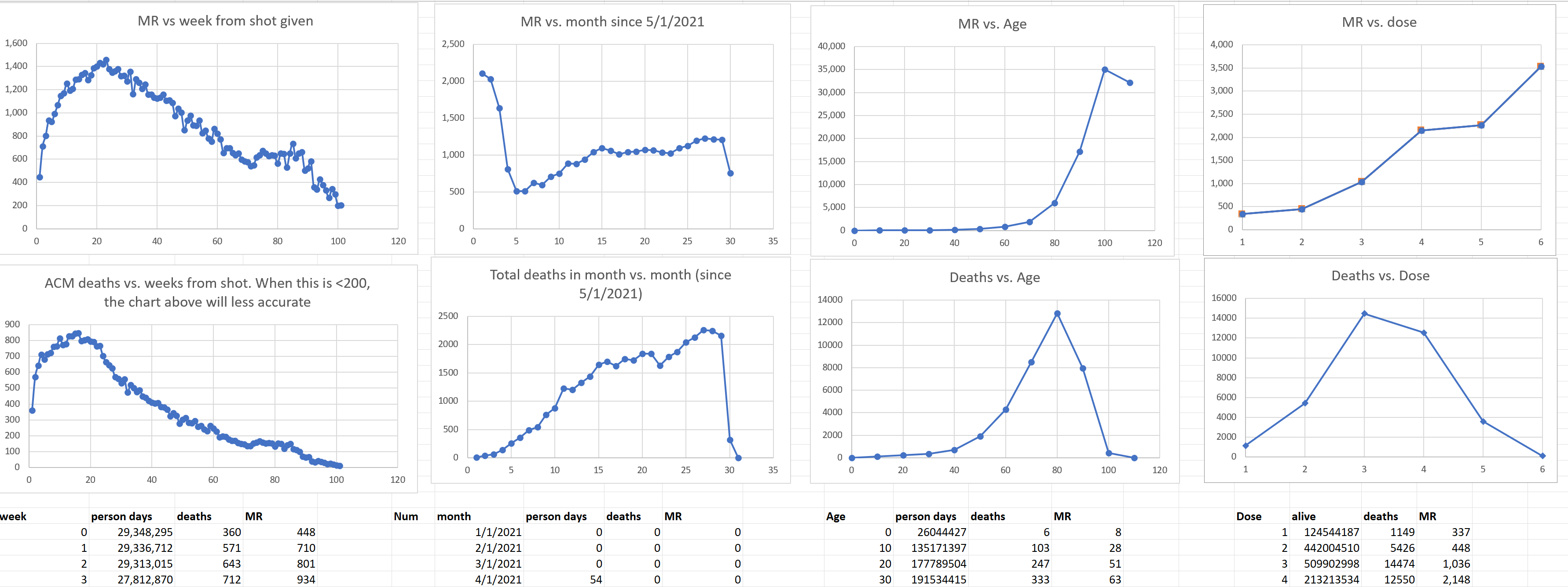
We are done. Nobody wants to go on camera and debate me on this. They would lose. Badly. Those curves should be relatively flat lines, not curves with a hump. You don’t need a control group on that kind of signal. IT IS UNPRECEDENTED.
Even self-proclaimed experts, like David Gorski were unable to find a problem in my spreadsheet or buckets.py. If there are no errors, you have to accept the results. The methodology is proven and accepted, the execution was flawless.
The fact that there are missing doses for a given person is immaterial. We are always comparing dose 3 people with dose 3 people, for example.
And if the vaccine was as safe as claimed, missing doses for anyone is immaterial since all doses are placebo shots and make no difference.
The charts from Medicare are even more extreme than these. For all safe vaccines the line slopes down. For the COVID vaccine, the line slopes up. Nobody has ever seen anything like this. It is unprecedented in the history of Medicare. No counterexamples.
This is why nobody will debate me on camera on this data.
This is why no country is releasing the record-level data (RLD). If the vaccine was safe, they’d be making the RLD widely available as well as the detailed time-series cohort analysis. See anyone doing that? Nope. It’s because they know the vaccines are killing people.
I even offered to take down my data if Health New Zealand showed me that my time-series analysis is wrong and the vaccines are safe. No response. Crickets.
Executive summary
Today you will get to see the data that nobody wants you to see. FINALLY.
No State or country has ever released record-level public health data on any vaccine.
Privacy is not the reason for this; the data can be easily obfuscated (which we did on this data) so that no record entry would match that of any person, living or dead.
The reason the data is kept secret is simple: it would expose the fact that the COVID vaccines are unsafe, as well as all the vaccines that I have been able to get record-level data on.
Short responses to criticisms about the data
I posted a link to this section of the doc on X so that people can list any objections I need to counter that aren’t already listed.
Here is are the response points to all the criticisms I’m aware of. The tl;dr is that all of the critiques don’t move the needle.
- I know the leaker and got the data on Nov 9.
- I verified the identity of the leaker and the authenticity of the data and chain of custody.
- There is no doubt about the authenticity. NZMH would have said the data is fake if it was. That would immediately discredit it. But they didn’t because that would be criminal. So they decided to distract people by going after the leaker and calling him a misinformation spreader for leaking the ACTUAL records.
- The data available publicly has been anonymized. That is why they acknowledged this and couldn’t find any matching records. Anyone who thinks their personal data was leaked is delusional.
- There is only one way to analyze this data definitively and that’s with a time-series cohort analysis. This is the exact same methodology the UK ONS used to analyze their vaccine data. The difference is our buckets are one week long so we can see things they are trying to hide. So if you want to dispute the analysis, you either have to show one of 3 things: that 1) our buckets.py program has a bug or 2) that all the mortality curves are flat or relatively flat, or 3) that the dataset is somehow compromised by showing that one of the four graphs is nonsensical or 4) that the v4 xlsx file has a bug in it. Nobody has done #1, and #2 is impossible. Nobody has even attempted #3 or #4. So basically, all the “attacks” are a ridiculous waste of time. There is a way to attack this if it is wrong, but nobody seems capable of figuring it out. I just told you the answer. Go prove I’m wrong using this method and I’m all ears. I did it the professional way just like the UK did. If I made a mistake, tell me what it is. But having each person do their own “ad hoc” analysis is not how you analyze the data. The gold standard is time-series cohort.
- The 1 death per 1,000 doses is consistent with other careful analyses such as Rancourt.
- UPenn Professor Jeffrey Morris wrote “But without data on controls and without comorbidities the most you could ever do is claim the data are suggestive” is false. This is nearly the entire population of New Zealand. We know the stats. The rise in mortality is correlated with each vaccine shot. When you add the shot data together for all shots, the hump becomes even more well defined. This is like saying that if there is a mass shooting and 25 people died, that we can’t know if it was the bullet that killed them because they might have died all died spontaneously right before the bullet hit. And if the time-series cohort analysis showed that the death rate jumped 500% exactly 10 days after the shot, would Morris stick to his statement? He’s simply not credible. He wants to make every excuse imaginable to avoid saying what the data shows. He should assume it’s a normal population. And you can limit the time window of observation to before COVID, during COVID, and after COVID and see the same signals. Without controls, you have to work a little harder to validate there are no significant confounders, but “scientists” such as Morris want perfect data on everyone which never exists. He has never explained the mortality graph from Medicare showing a 26% mortality increase in 365 where the number of deaths per day increases monotonically. That is impossible if the vaccine is safe. It always always slopes down. You don’t need a control group. The slope goes the wrong way. That is a 5 alarm fire. It’s amazing he doesn’t know this.
- There is no rebuttal from anyone in the medical community showing:
- buckets.py has an error
- the analysis in the v4 spreadsheet has an error
- a credible excess death estimate under 100 deaths per 100K doses based on the data (they all refuse to show us their calculation)
- any epidemiologist with a higher h-index than Risch claiming that this data could possibly be consistent with a safe vaccine.
- a more accurate way to calculate the baseline that is based on other similar data.
- any evidence that my most “damaging curve” in my MIT presentation is wrong (a 50% increase in deaths per day from baseline after 180 days). Why is nobody touching that?? I don’t get it. If there is one thing to disprove, start with the strongest point.
- Nobody seems to want to comment on this which is consistent with my analysis of the NZ data. The spreadsheet clearly shows it is those over 60 seeing the excess mortality which precisely matches the public data: